Storytelling with data
I used to be terrible at story telling…
If you’ve looked at the rest of my website, connected with me on Linkedin or basically held a conversation with me for more than 10 seconds, you’ll see that my life revolves around data. Specifically, using said data to create engaging & insightful content for the companies I work for.
Now I’m far from an exhaustive expert in the field, but I’m a lot more successful at storytelling in general than I used to be. When I used to provide reports and give presentations early on in my career I was often met with blank stares, confusion or even worse; total disengagement from my audience. I never took the time to understand why structure, pacing and empathy were critical components to crafting a cohesive story.
So what changed between then and now? In particular, how do those aforementioned components translate to a professional environment where decisions need to be made based on digesting large volumes of data frequently?
Let’s take a brief journey by addressing some of my biggest mistakes, and how they might also help you in your own data adventures.
First, make sure a story is there to begin with
This might sound obvious, but I’ve seen this happen all too often in corporate settings and I still have to face into it myself.
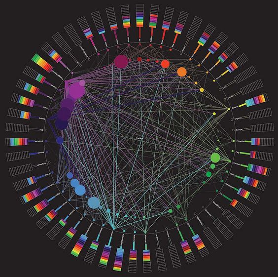
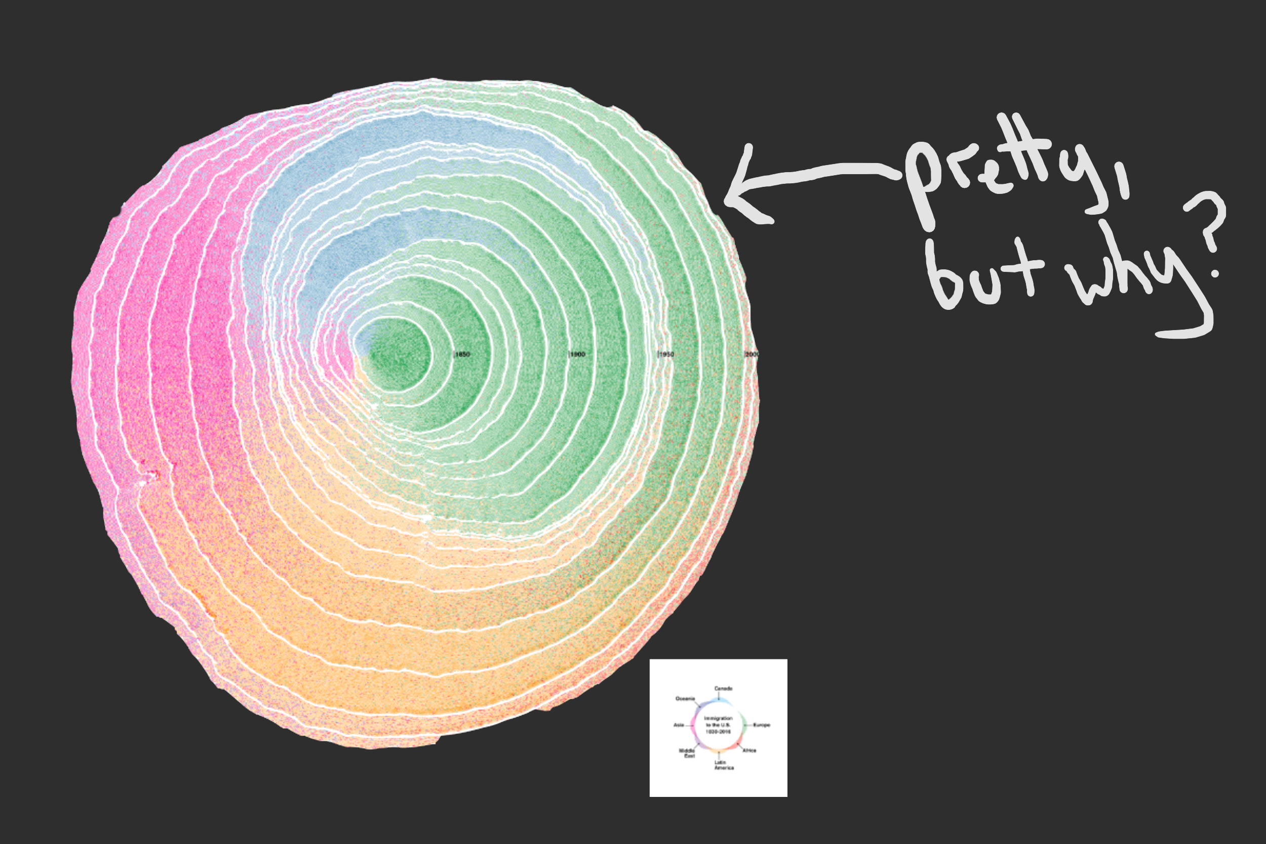
Imagine you’re in a meeting, and the presenter gets up and opens a Powerpoint pack (I know, stay with me). After setting the agenda and walking through an intro, they then produce a graph. The graph looks okay, and it sure does fit with the general colour palette in the other slides, but for the life of you, you can’t make heads or tails of what point the chart is trying to convey.
Thankfully, someone puts their hand up and asks the question that was on the tip of your toungue; ‘…and what is it we’re looking at here, presenter?’ They ask, followed by a meek ‘oh, this just shows the data we’ve collected up to this point, there’s nothing actually to see here until the next topic a few more slides in’.
There are three key pain points to be addressed in this scenario:
- The point of a chart, report or data visualisation is to help answer a question, or provide insights on a complex topic. If you aren’t using the data for a specific purpose, you’re simply presenting a set of numbers and letters to the audience.
- Context matters. The data must relate to the question and the narrative that has been presented up to this point.
- You can’t expect the audience to generate the question, or have them try to use the data to create their own narrative from scratch.
Then, let them know its their data
Ok, so we now have a handle on what not to do, but how do we course correct? Regardless of the setting you’re presenting the data in, whether it be in a Powerpoint, a verbal presentation or just a standalone report, you need to make a connection between the audience and the data. Specifically:
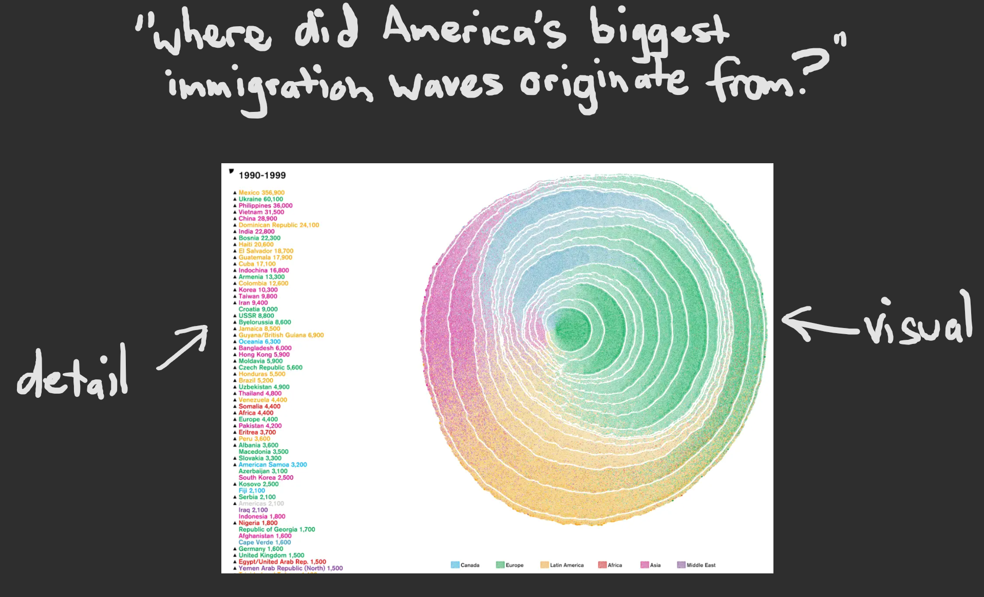
- Let the audience know what question you’ll be exploring. This question can be close-ended, for example ‘Are we set to meet our quarterly commitments?’ or an open-ended question like ‘How many times did the word ‘unprecedented’ get mentioned in 2020?’
- Provide an ‘anchor’ to let the audience know where to start, by providing a specific data point or focus area on the data visualisation
- Provide both visual and non-visual alternatives. Assume that half of your audience prefers to consume information through visuals and metaphors, and the other half prefers tables and numbers. Quite often people will correlate both mediums to further understand the information presented.
Finally, let them tell you their insights
We’ve now set the scene and provided information in multiple formats, now it’s time to kick-start your audience’s thinking and get them to start providing their own insights and answers. There is, still, a method to accomplish this to ensure your audience remains fully engaged throughout the process:
- Don’t try to keep the audience ‘on the rails’ forever. What I mean is don’t provide a conclusive summary of exhaustive answers right after you’ve posed the question, or you’ll lose your audience again. Keep them engaged by leaving a few loose threads to maintain engagement (who knows, they might find something you’d never considered!)
- Allow people to drill down and ‘explore’ the data themselves. This goes especially for those presenting the data in a digital medium. This means allowing the audience to focus on specific areas of the visual and view the underlying source data themselves.
- Provide a space for your audience to provide their own insights and establish a feedback loop. Chances are the data you’re presenting is fairly complex in nature and difficult for any single person to process and report on. Build an inclusive network to ensure you get the maximum value out of anything you produce!
Simulated dendrochronology of U.S. immigration (1830-2015) from Pedro M. Cruz on Vimeo.
In closing
Data visualisation is about more than just creating pretty, colourful reports (although it is a lot of fun). Ultimately we’re trying to bridge the gap between the ‘question’ and the ‘answer’, even if we can’t fully cross said bridge yet.
There are many ways to incorrectly handle and present data, but if you take the time to properly structure the end-to-end feedback loop of information you can contribute towards a healthy data-driven culture in your line of work.
 Check out my Dependency Mapper app for Jira!